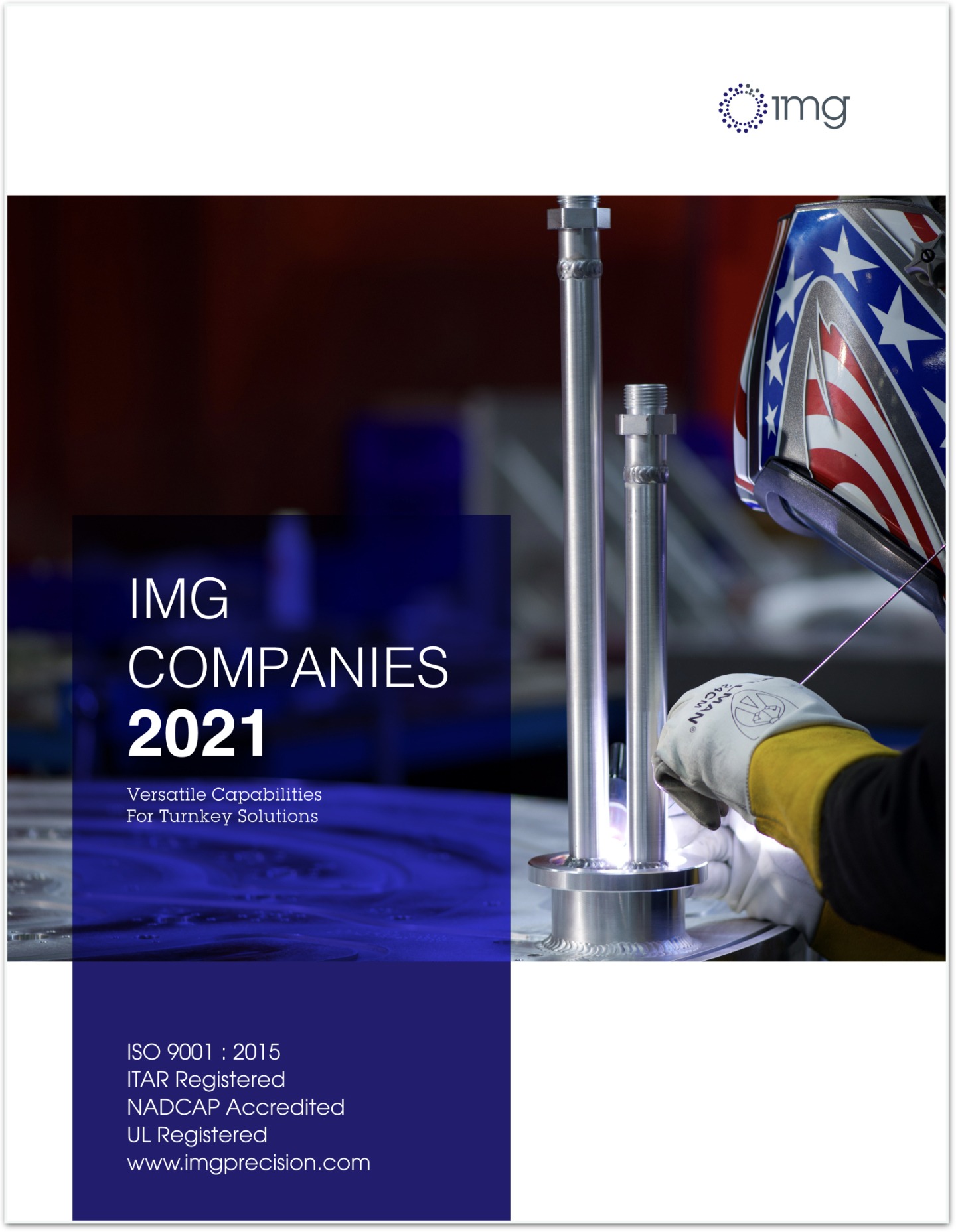
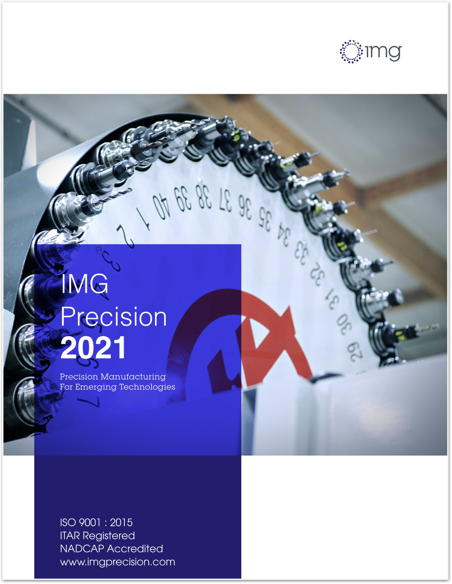
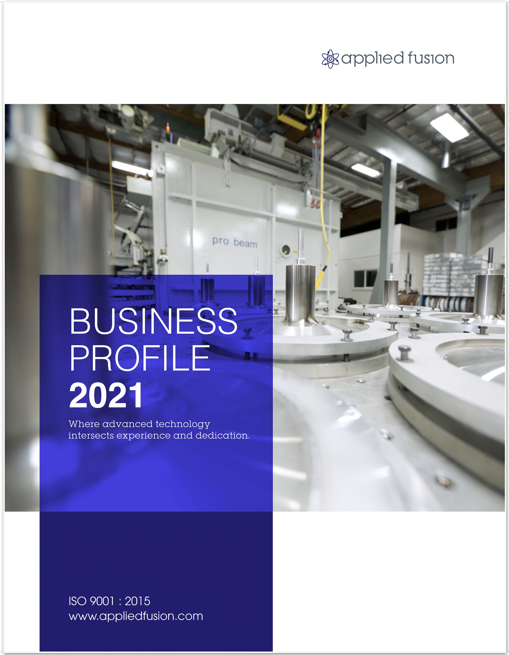
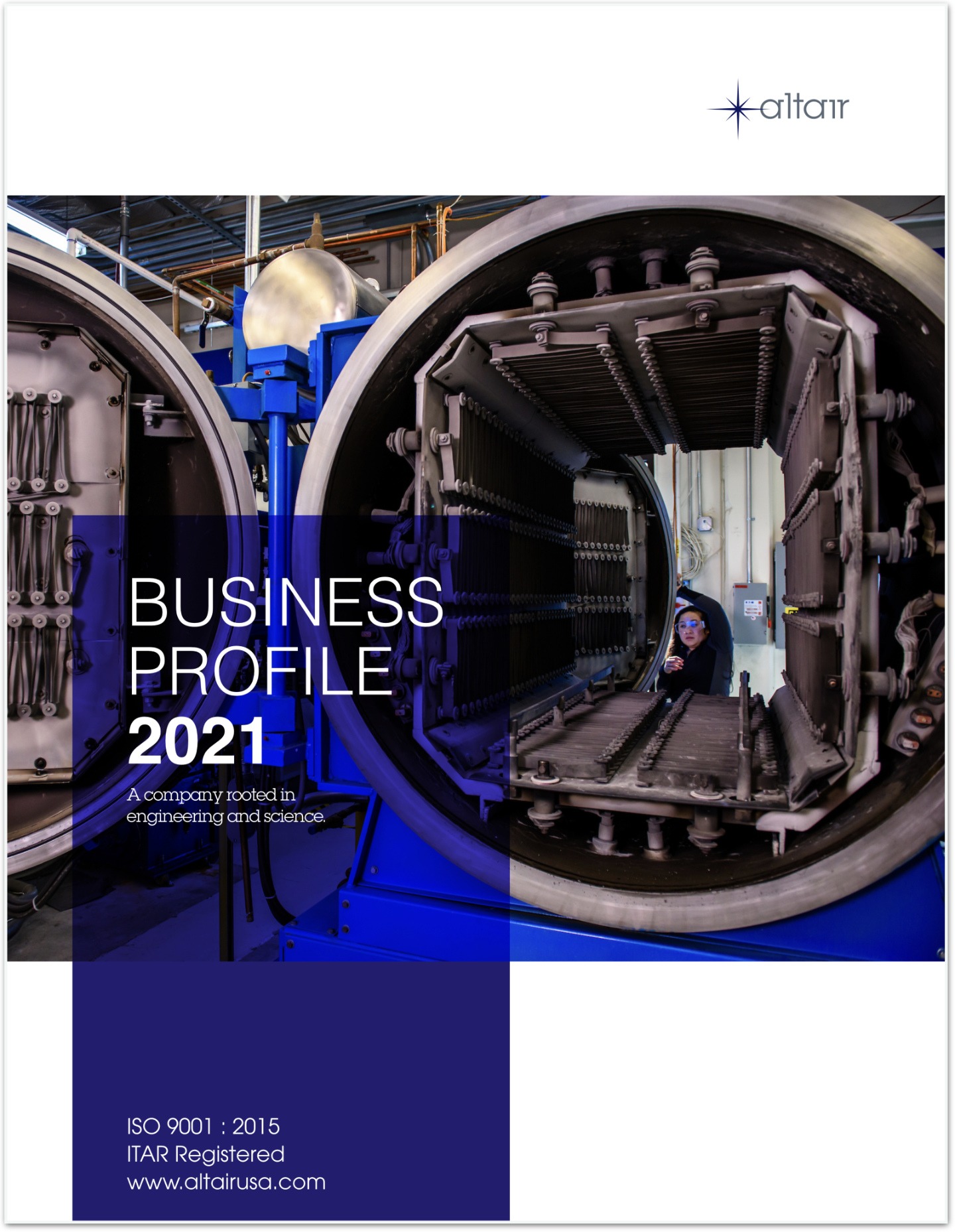
This was a fun brochure project that required us to sync the parent company’s five websites, logos, copy with a big brochure layout with plenty of space. Because we built most of their websites and our professional photography was the cornerstone of their style, it was fairly easy to produce these with the basic same style.
We first developed the layout to agree upon with the customer, then it was lights out production until completion and approvals. Most of the brochures only had a few iterations of small changes which made this project fun and creative.


